Henley Oyster Co.
Brand Narrative / Brand World
The Brief
—
Name and design a new food offering for casual dining in the Henley area.
The Solution
—
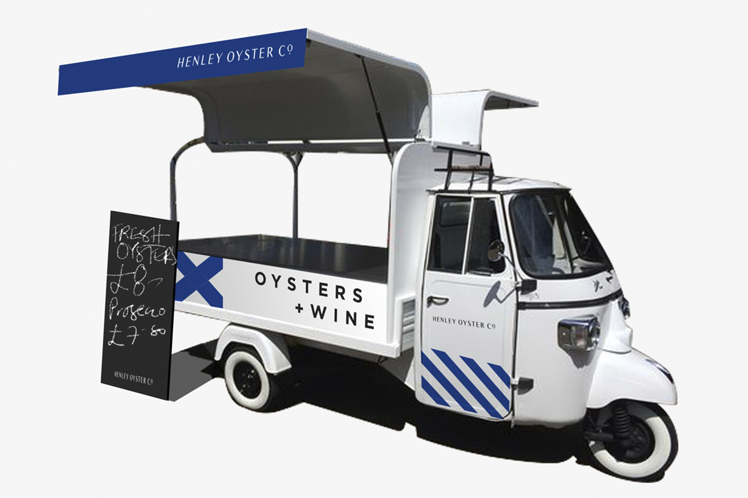
Henley Oyster Co. is a mobile oyster + wine cart set to tour Henley-on-Thames and the surrounding areas.
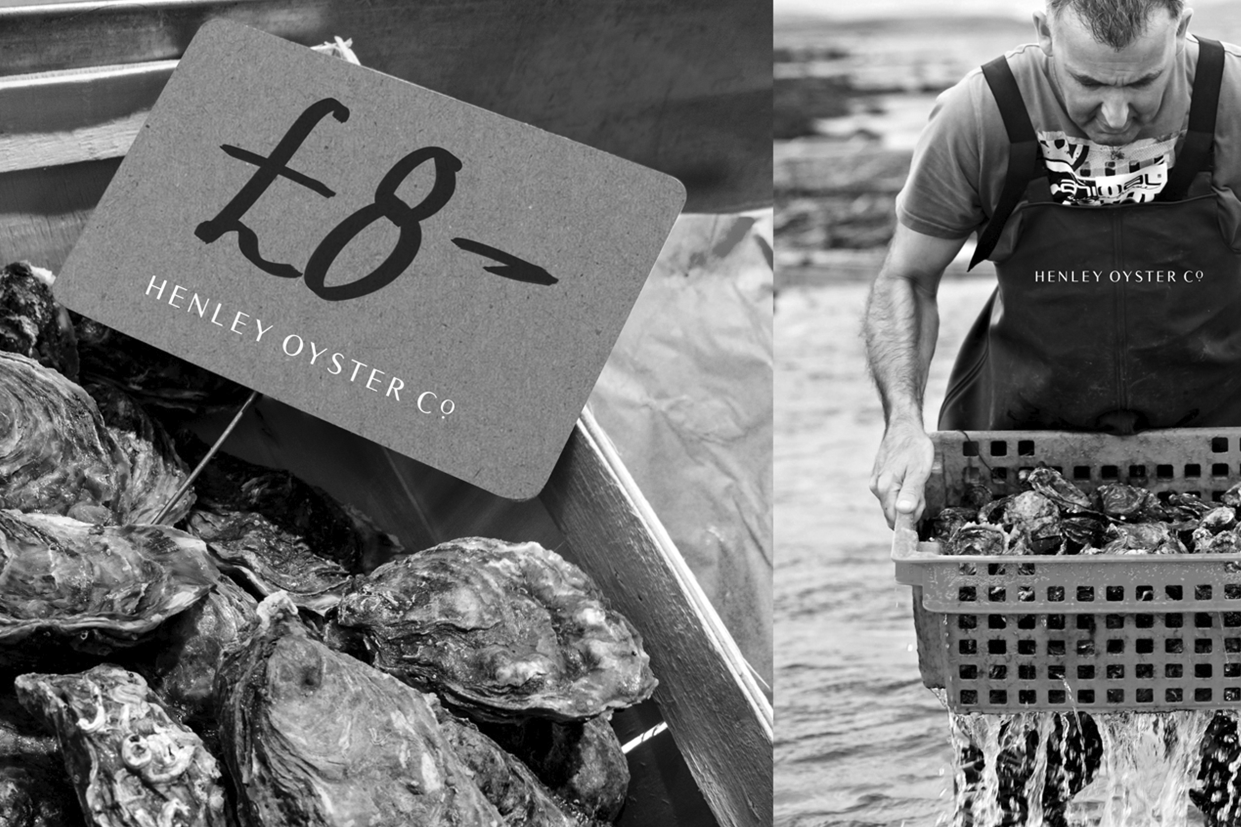
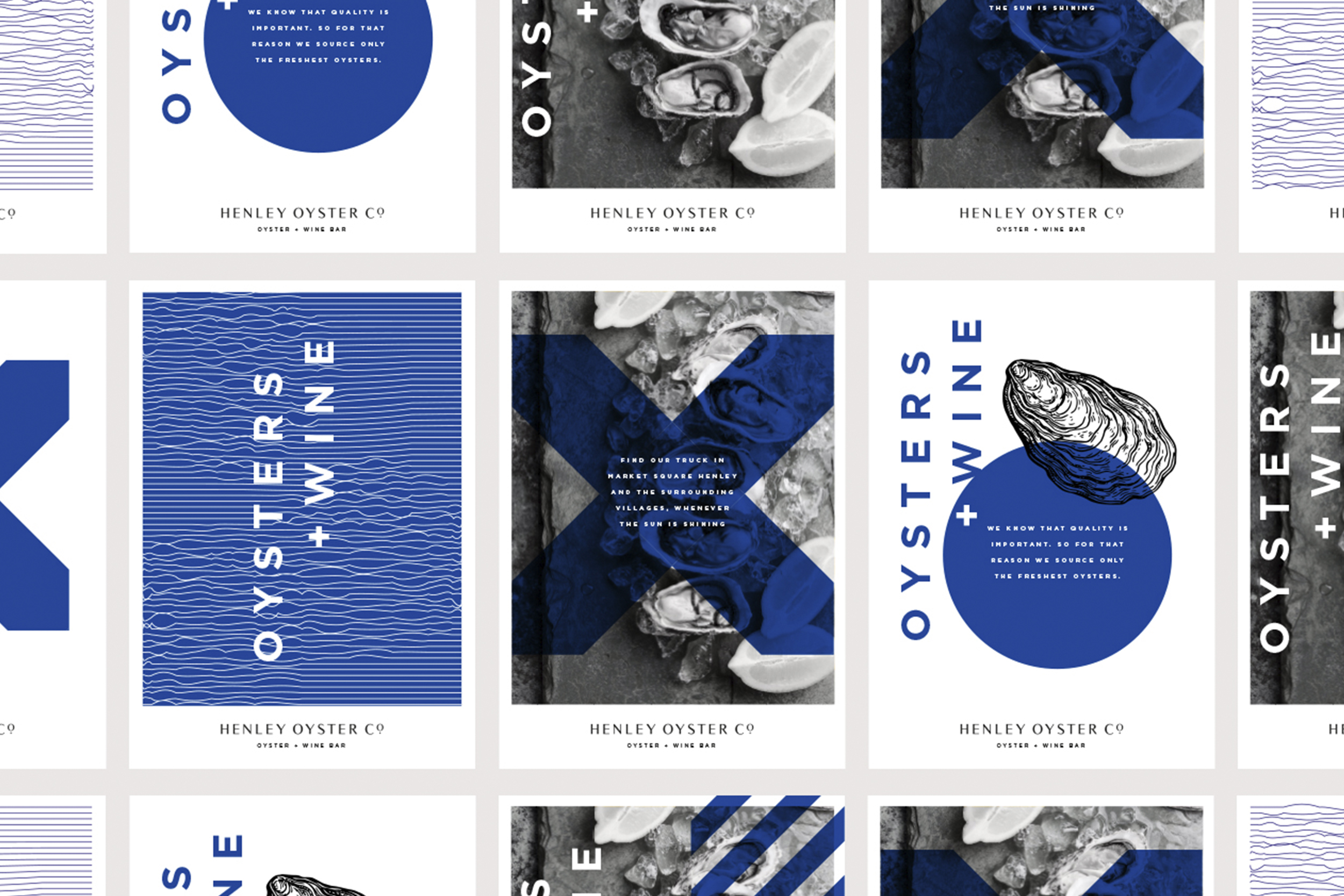
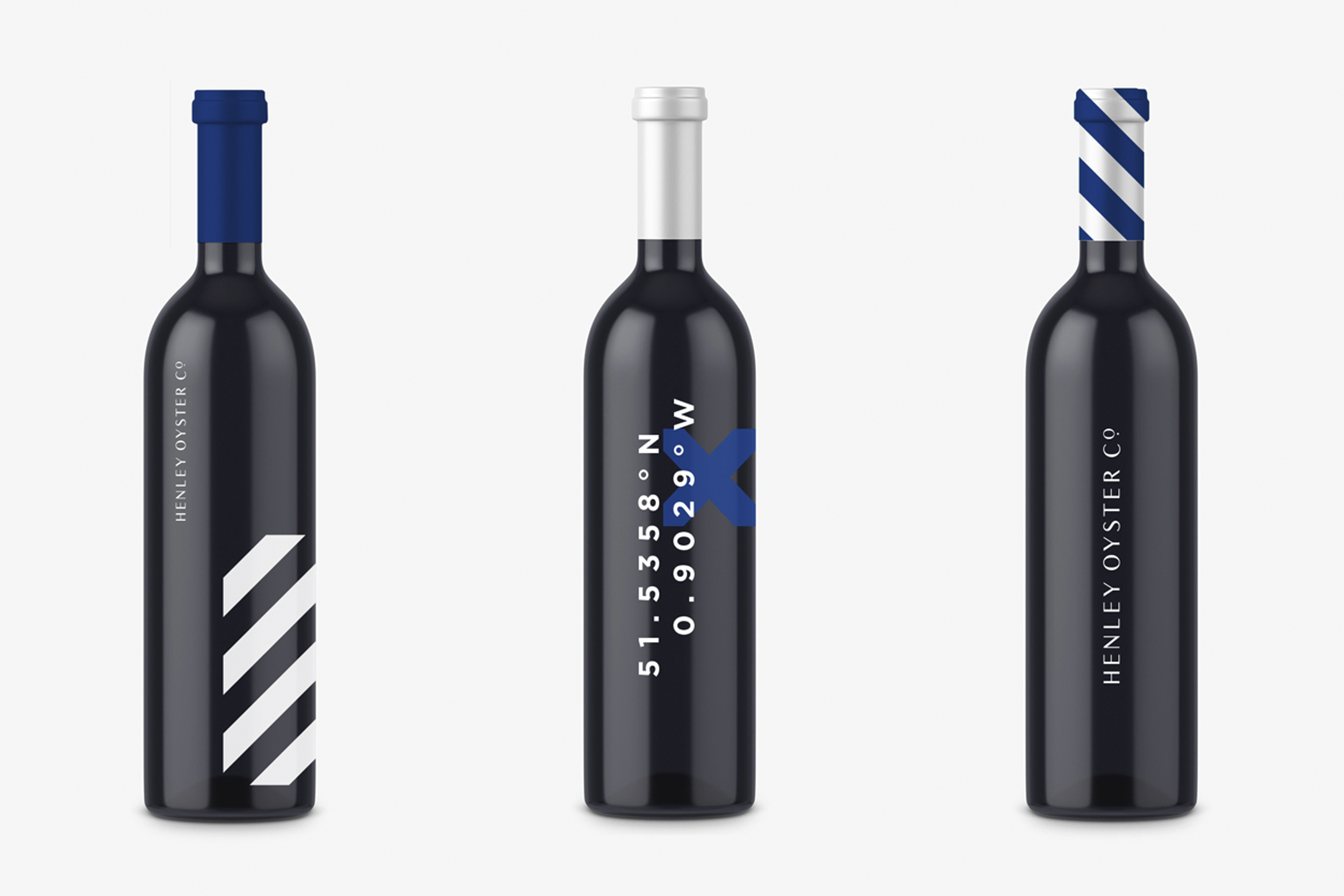
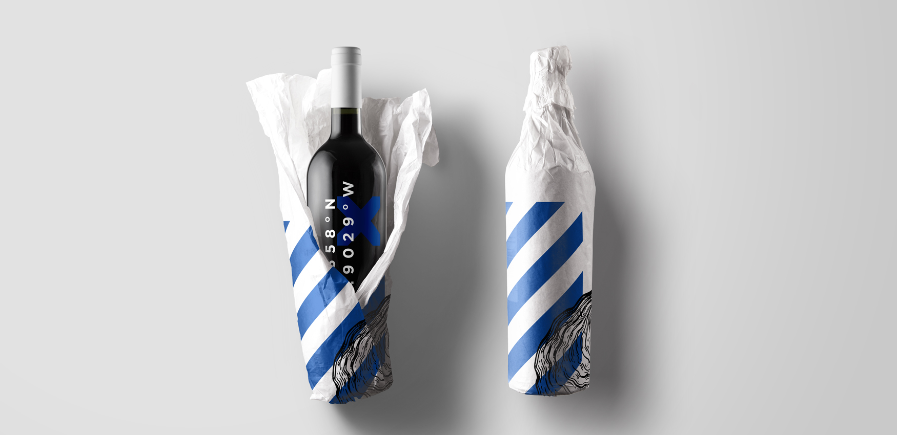
Prestigious but with a contemporary twist was the brief for the brand. Taking inspiration from the geometric nautical alphabet and naval flags, the longitude and latitude of the market square in Henley-on-Thames and photography which heroes the core offering; we created a flexible identity system which works across a variety of applications.
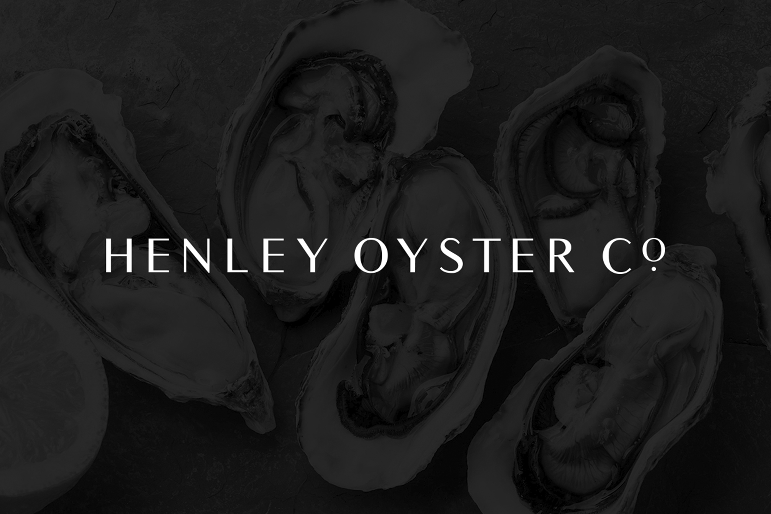
The logotype is crafted from the ubiquitous Times New Roman, a contemporary take on an old classic. The use of the small dot is a subtle nod to the precious pearls found within oysters.
